1
2
3
4
5
6
7
8
9
10
11
12
13
14
15
16
17
18
19
20
21
22
23
24
25
26
27
28
29
30
31
32
33
34
35
36
37
38
39
40
41
42
43
44
45
46
47
48
49
50
51
52
53
54
55
56
57
58
59
60
61
62
63
64
65
66
67
68
69
70
71
72
73
74
75
76
77
78
79
80
81
82
83
84
85
86
87
88
89
90
91
92
93
94
95
96
97
98
99
100
101
102
103
104
105
106
107
108
109
110
111
112
113
114
115
116
117
118
119
120
121
122
123
124
125
126
127
128
129
130
131
132
133
134
135
136
137
138
139
140
141
142
143
144
145
146
147
148
149
150
151
152
153
154
155
156
157
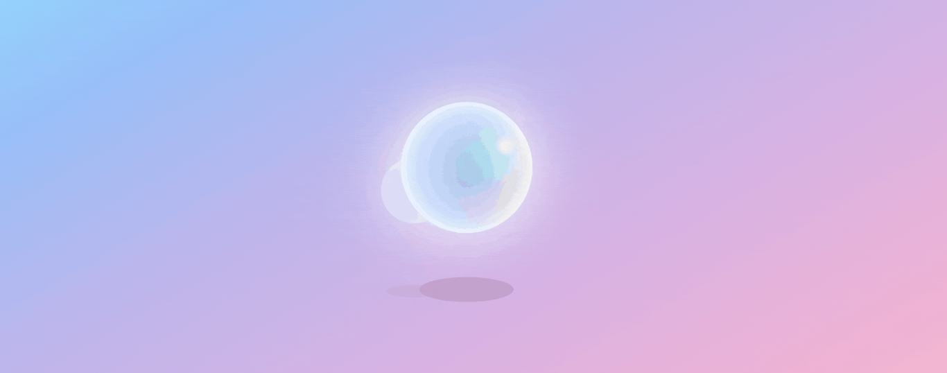
| <!DOCTYPE html>
<html lang="en">
<head>
<meta charset="UTF-8">
<meta http-equiv="X-UA-Compatible" content="IE=edge">
<meta name="viewport" content="width=device-width, initial-scale=1.0">
<title>道心の前端小窝</title>
<style>
body {
/* 背景渐变 */
background-image: linear-gradient(to bottom right,
#91defe,
#99c0f9,
#bdb6ec,
#d7b3e3,
#efb3d5,
#f9bccc);
display: flex;
flex-direction: column;
align-items: center;
justify-content: center;
height: 100vh;
overflow: hidden;
}
.box {
position: absolute;
display: flex;
flex-direction: column;
align-items: center;
justify-content: center;
height: 500px;
left: 50%;
top: 50%;
transform: translate(-50%, -50%);
}
.ball {
animation: float 3.5s ease-in-out infinite;
height: 200px;
width: 200px;
border-radius: 50%;
position: relative;
/* 为球的背景添加径向渐变,渐变中心在 77% 水平、30% 垂直位置 */
background: radial-gradient(circle at 77% 30%,
/* 渐变起点颜色为白色,半径为 5 像素 */
white 5px,
/* 渐变颜色从白色平滑过渡到淡蓝色,半径为 8% */
aqua 8%,
/* 渐变颜色从淡蓝色平滑过渡到深蓝色,半径为 60% */
darkblue 60%,
/* 渐变颜色从深蓝色平滑过渡到淡蓝色,半径为 100% */
aqua 100%);
/* 为球添加多重内阴影效果 */
/* 内部白色阴影,宽度 20 像素 */
box-shadow: inset 0 0 20px #fff,
/* 内部淡蓝色阴影,位置偏右 10 像素,宽度 46 像素 */
inset 10px 0 46px #eaf5fc,
/* 内部浅蓝色阴影,位置偏右 88 像素,宽度 60 像素 */
inset 88px 0px 60px #c2d8fe,
/* 内部淡橙色阴影,位置偏左上方,宽度 100 像素 */
inset -20px -60px 100px #fde9ea,
/* 内部淡橙色阴影,位置偏下方,宽度 140 像素 */
inset 0 50px 140px #fde9ea,
/* 外部白色阴影,宽度 90 像素 */
0 0 90px #fff;
}
.box:nth-child(2) {
z-index: -999;
}
.box:nth-child(2) .ball {
left: -80px;
top: 35px;
width: 100px;
height: 100px;
z-index: -999;
opacity: .5;
}
.box:nth-child(3) .ball {
left: 80px;
top: -80px;
width: 20px;
height: 20px;
opacity: .1;
}
.shadow {
background: #b490b27c;
width: 150px;
height: 40px;
top: 70%;
animation: expand 4s infinite;
position: absolute;
border-radius: 50%;
}
.box:nth-child(2) .shadow {
width: 90px;
height: 20px;
top: 72.5%;
left: -75px;
opacity: .4;
}
/* 添加漂浮动画 */
@keyframes float {
0% {
transform: translatey(0px) rotate(-10deg);
}
50% {
transform: translatey(-80px) rotate(10deg);
}
100% {
transform: translatey(0px) rotate(-10deg);
}
}
@keyframes expand {
0%,
100% {
transform: scale(0.5);
}
50% {
transform: scale(1);
}
}
</style>
</head>
<body>
<div class="shell">
<div class="box">
<div class="ball"></div>
<div class="shadow"></div>
</div>
<div class="box">
<div class="ball"></div>
<div class="shadow"></div>
</div>
<div class="box">
<div class="ball"></div>
</div>
</div>
</body>
</html>
|