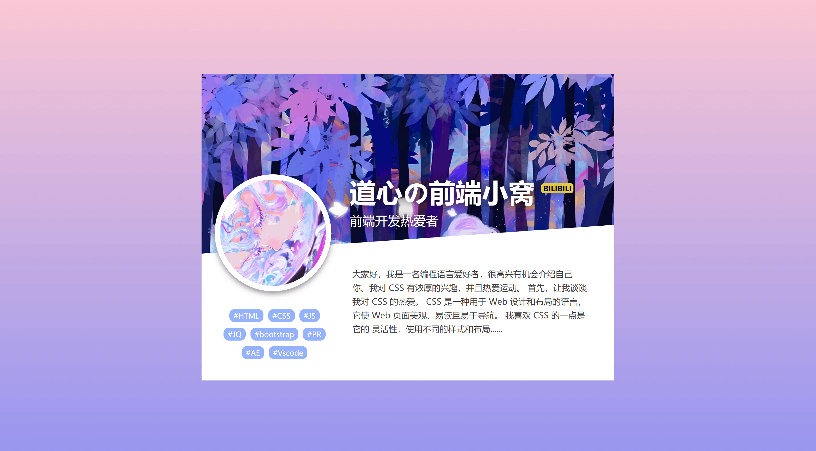
1
2
3
4
5
6
7
8
9
10
11
12
13
14
15
16
17
18
19
20
21
22
23
24
25
26
27
28
29
30
31
32
33
34
35
36
37
38
39
40
41
42
43
44
45
46
47
48
49
50
51
52
53
54
55
56
57
58
59
60
61
62
63
64
65
66
67
68
69
70
71
72
73
74
75
76
77
78
79
80
81
82
83
84
85
86
87
88
89
90
91
92
93
94
95
96
97
98
99
100
101
102
103
104
105
106
107
108
109
110
111
112
113
114
115
116
117
118
119
120
121
122
123
124
125
126
127
128
129
130
131
132
133
134
135
136
137
138
139
140
141
142
143
144
145
146
147
148
149
150
151
152
153
154
155
156
157
158
159
160
161
162
163
164
165
166
167
168
169
170
171
172
173
174
175
176
177
178
179
180
181
182
183
184
185
186
187
188
189
190
191
192
193
194
195
196
197
198
199
200
201
202
203
204
205
206
207
208
209
210
211
212
213
214
215
216
217
218
219
220
221
222
223
224
225
226
227
228
229
230
231
232
233
234
235
236
237
238
239
240
241
242
243
244
245
246
247
248
249
250
251
252
253
254
| <!DOCTYPE html>
<html lang="en">
<head>
<meta charset="UTF-8">
<meta name="viewport" content="width=device-width, initial-scale=1.0">
<title>道心の前端小窝</title>
<style>
* {
margin: 0;
padding: 0;
box-sizing: border-box;
}
body {
background-color: hsl(223, 90%, 40%);
color: hsl(0, 0%, 100%);
font: 1em/1.5 Rubik, sans-serif;
display: flex;
height: 100vh;
transition: background-color 0.3s, color 0.3s;
}
/* 时钟容器样式 */
.clock {
--hrAngle: 0;
--minAngle: 0;
--secAngle: 0;
border-radius: 50%;
margin: auto;
outline: transparent;
position: relative;
width: 12em;
height: 12em;
transform: rotateX(30deg) rotateY(-30deg) rotateZ(30deg);
transform-style: preserve-3d;
transition: transform 0.3s cubic-bezier(0.42, 0, 0.58, 1);
}
/* 时钟头像样式 */
.profile {
background-color: hsl(223, 10%, 50%);
border: 0;
border-radius: 50%;
box-shadow: 0 0 0 0.25em hsla(223, 90%, 10%, 0.6);
display: block;
margin: 7.75em auto 0 auto;
width: 2em;
height: 2em;
}
/* 鼠标悬停时钟样式 */
.clock:focus-visible,
.clock:hover {
transform: rotateX(0) rotateY(0) rotateZ(0);
}
/* 时钟数字容器样式 */
.digits {
display: flex;
justify-content: center;
align-items: end;
line-height: 1;
margin-top: 2.25em;
user-select: none;
}
/* 时钟数字组样式 */
.digit-group {
margin: 0 0.1em;
width: 2ch;
}
.digit-group[data-unit="h"] {
text-align: right;
}
.digit-group--small {
font-size: 0.75em;
}
/* 时钟指针、层和环样式 */
.hand,
.layer,
.ring {
position: absolute;
}
/* 时钟指针样式 */
.hand {
bottom: calc(50% - 0.5em);
left: calc(50% - 0.5em);
width: 1em;
mix-blend-mode: difference;
perspective: 4.25em;
transform-origin: 0.5em calc(100% - 0.5em);
transition: .5s;
}
.hand--hr {
height: 2.75em;
transform: rotate(var(--hrAngle)) translateY(-2em);
}
.hand--min {
height: 3.75em;
transform: rotate(var(--minAngle)) translateY(-2em);
}
.hand--sec {
width: .5em;
height: 3.75em;
transform: rotate(var(--secAngle)) translateY(-2em);
}
.hand:before {
background-color: hsl(0, 0%, 100%);
content: "";
display: block;
width: 100%;
height: 100%;
transform: rotateX(-30deg);
transform-origin: 50% 100%;
}
.hand--hr:before {
border-radius: 0.5em 0.5em 0.5em 0.5em / 0.5em 0.5em 0.75em 0.75em;
}
.hand--min:before {
border-radius: 0 0 0.5em 0.5em / 0 0 0.75em 0.75em;
}
.hand--sec:before {
border-radius: 0 0 0.25em 0.25em / 0 0 0.5em 0.5em;
}
.layer,
.ring {
border-radius: 50%;
inset: 0;
}
/* 时钟表盘层样式 */
.layer--face {
transform: translateZ(3.75em);
}
.layer--img {
background: url("./05.jpg") 0 0 / 100% 100%;
transform: translateZ(-3.75em);
}
.layer--profile {
transform: translateZ(11em);
}
/* 时钟遮罩层样式 */
.layer--shade {
background-color: hsla(223, 90%, 10%, 0.6);
}
.ring {
box-shadow: 0 0 0 0.625em hsl(0, 0%, 100%) inset;
}
</style>
</head>
<body>
<div class="clock">
<div class="layer layer--img"></div>
<div class="layer layer--shade"></div>
<div class="layer layer--face">
<div class="digits">
<span class="digit-group" data-unit="h">12</span>
<span>:</span>
<span class="digit-group" data-unit="m">00</span>
<small class="digit-group digit-group--small" data-unit="s">00</small>
<small class="digit-group digit-group--small" data-unit="ap">A</small>
</div>
<div class="hand hand--hr"></div>
<div class="hand hand--min"></div>
<div class="hand hand--sec"></div>
<div class="ring"></div>
</div>
<div class="layer layer--profile">
<img src="./04.jpg" alt="" class="profile">
</div>
</div>
</body>
<script>
// 页面加载完成后执行初始化操作
window.addEventListener("DOMContentLoaded", () => {
const c = new Clock7(".clock");
});
// 时钟类定义
class Clock7 {
constructor(el) {
this.el = document.querySelector(el);
this.init();
}
// 初始化函数
init() {
this.timeUpdate();
}
// 获取当前时间对象
get timeAsObject() {
const date = new Date();
let h = date.getHours();
const m = date.getMinutes();
const s = date.getSeconds();
return { h, m, s };
}
// 获取当前时间字符串
get timeAsString() {
const [h, m, s, ap] = this.timeDigitsGrouped;
return `${h}:${m}:${s} ${ap}M`;
}
// 获取当前时间数字组
get timeDigitsGrouped() {
let { h, m, s } = this.timeAsObject;
const ap = h > 11 ? "P" : "A";
if (h === 0) h += 12;
else if (h > 12) h -= 12;
if (m < 10) m = `0${m}`;
if (s < 10) s = `0${s}`;
return [h, m, s, ap];
}
// 更新时间显示
timeUpdate() {
this.el?.setAttribute("aria-label", this.timeAsString);
const time = this.timeAsObject;
const secFraction = time.s / 60;
const minFraction = (time.m + secFraction) / 60;
const hrFraction = (time.h + minFraction) / 12;
this.el?.style.setProperty("--secAngle", `${360 * secFraction}deg`);
this.el?.style.setProperty("--minAngle", `${360 * minFraction}deg`);
this.el?.style.setProperty("--hrAngle", `${360 * hrFraction}deg`);
Array.from(document.querySelectorAll(`[data-unit]`)).forEach((unit, i) => {
unit.innerText = this.timeDigitsGrouped[i];
})
clearTimeout(this.timeUpdateLoop);
this.timeUpdateLoop = setTimeout(this.timeUpdate.bind(this), 1e3);
}
}
</script>
</html>
|